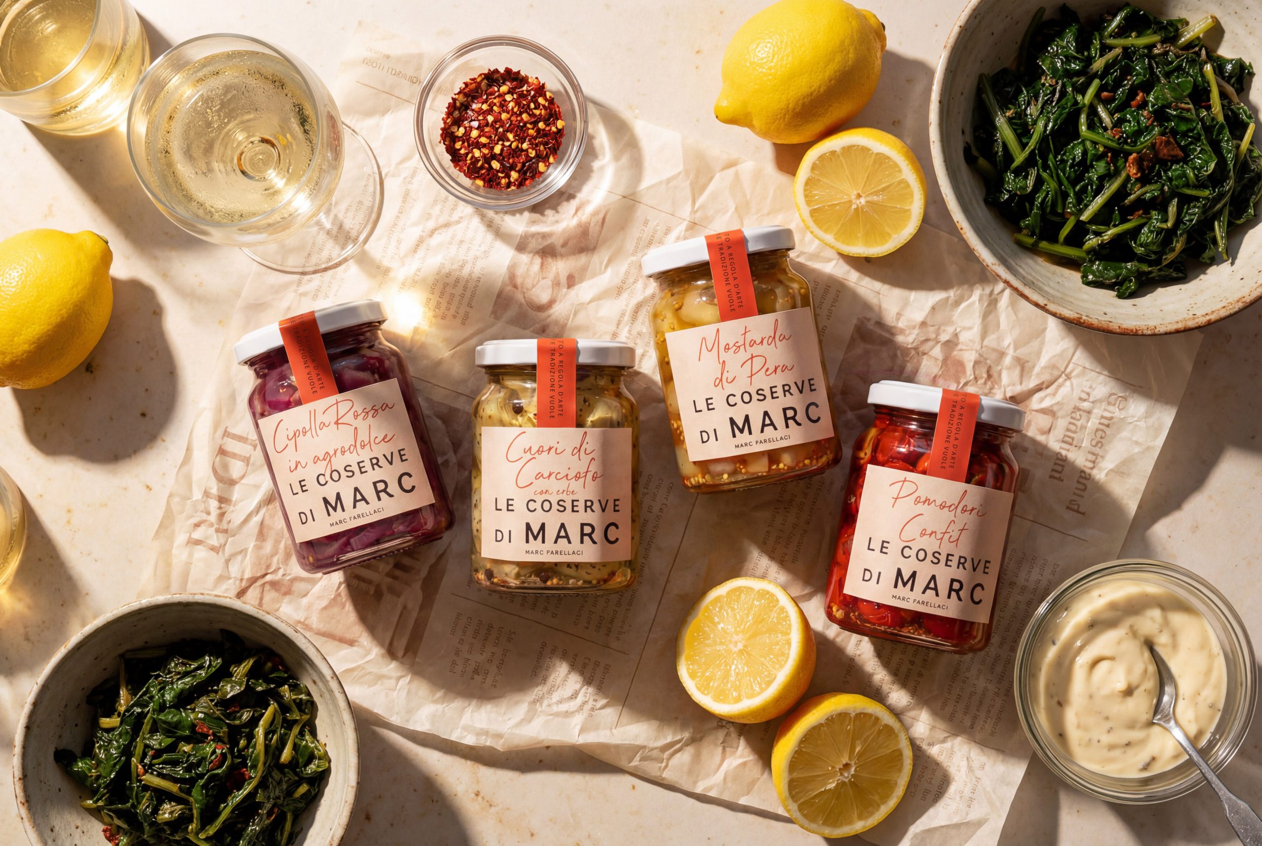
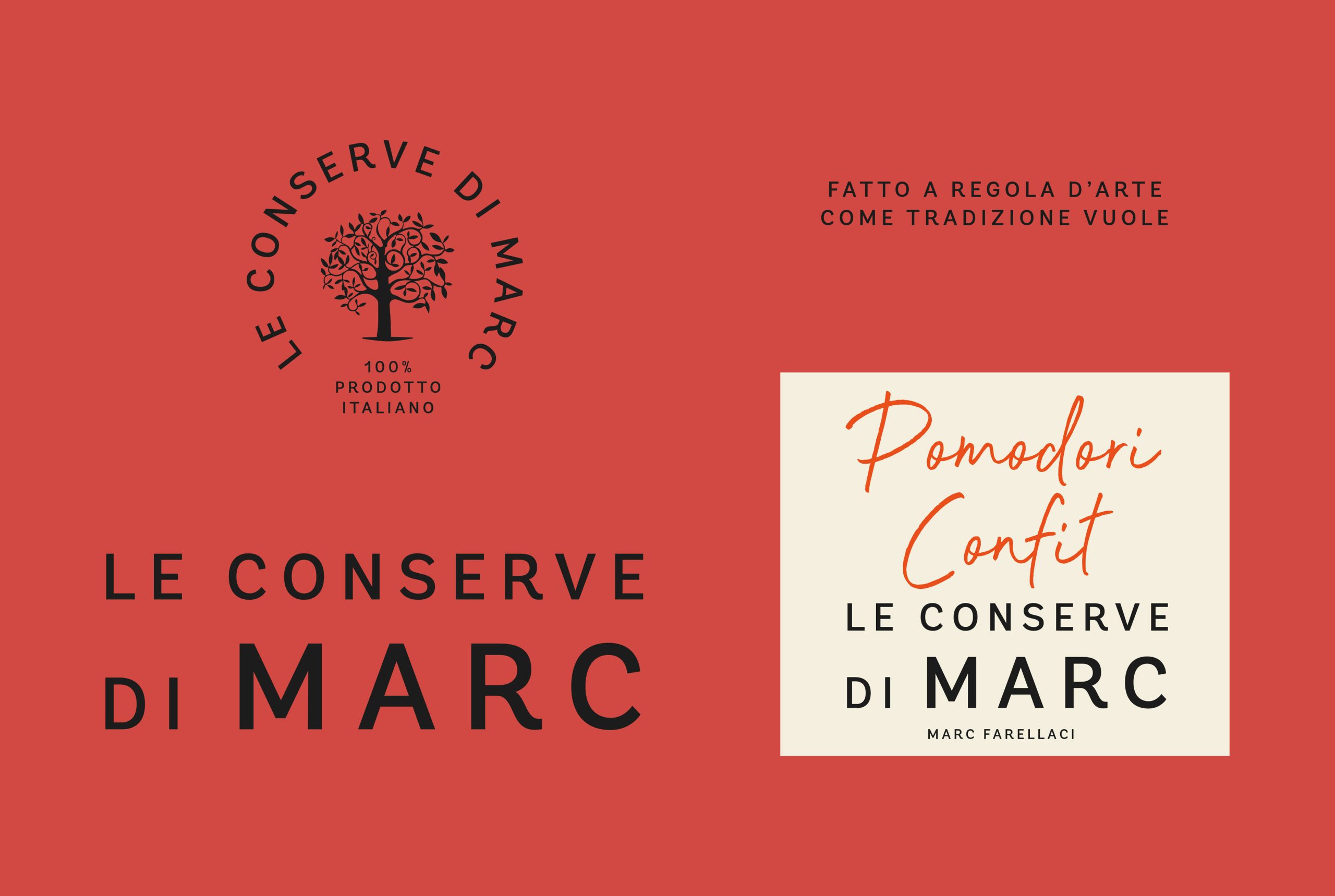
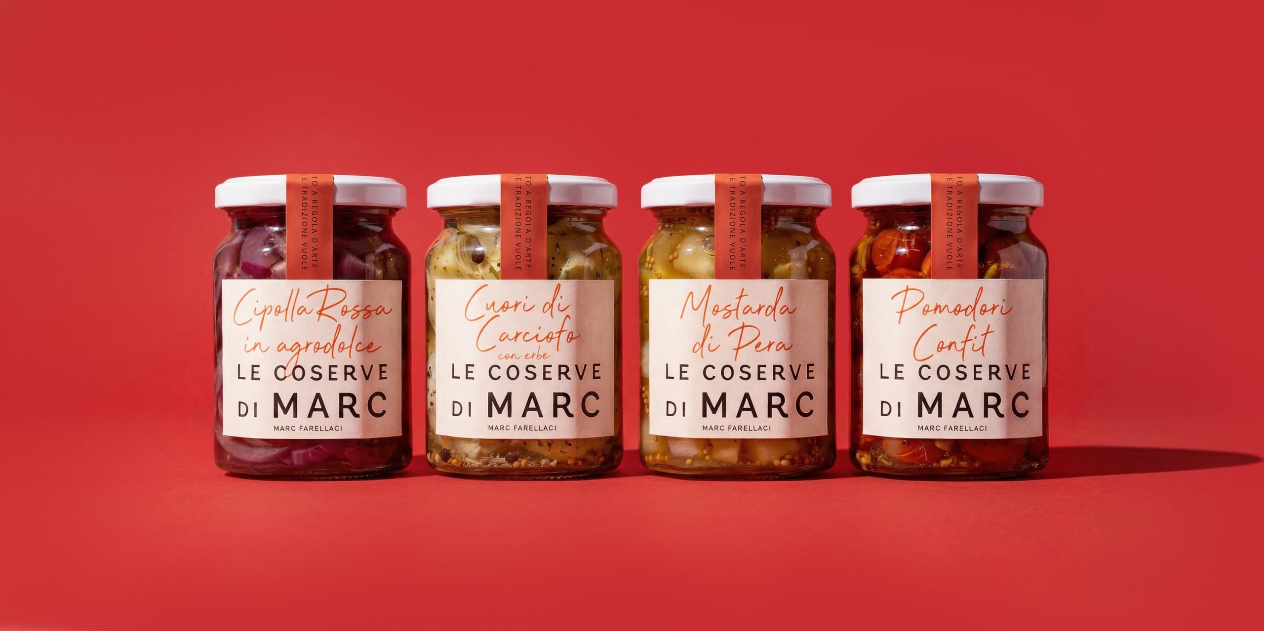
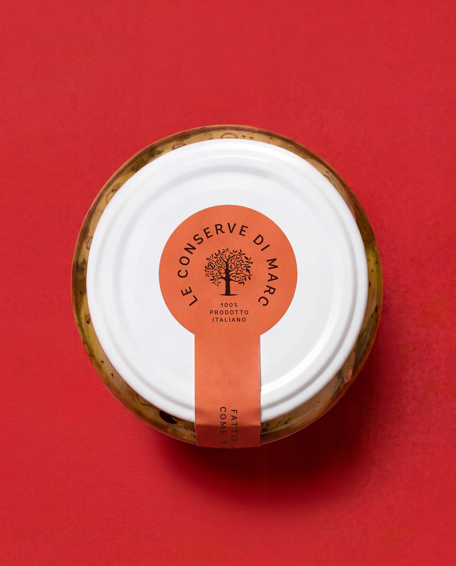
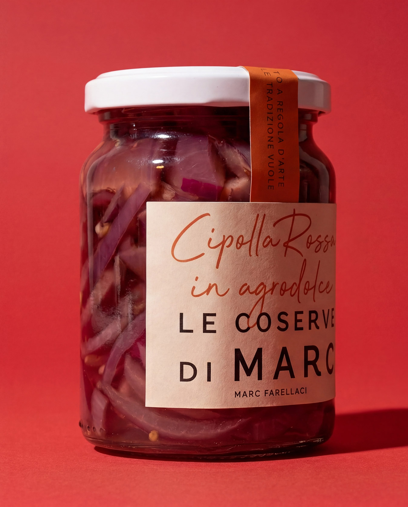
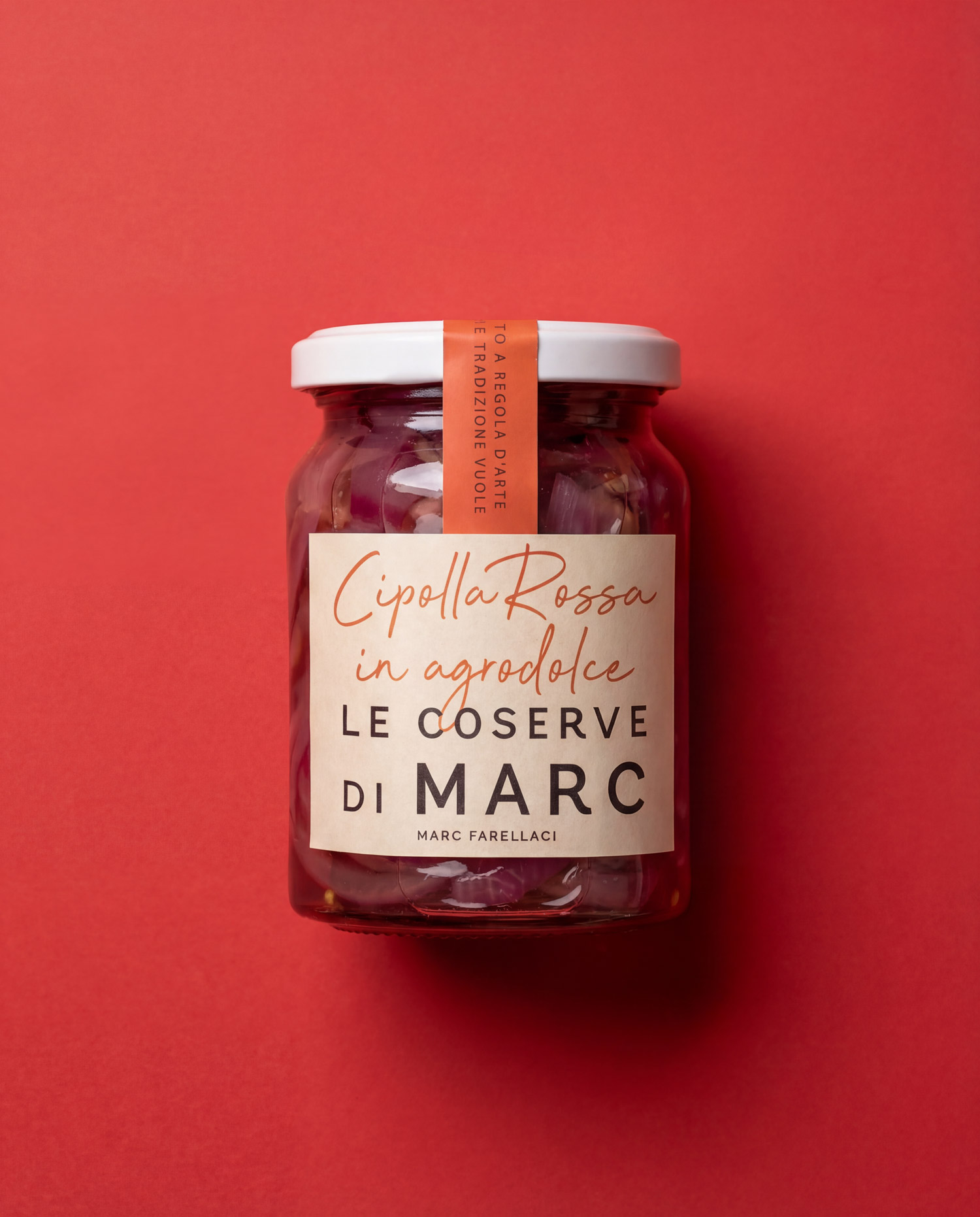
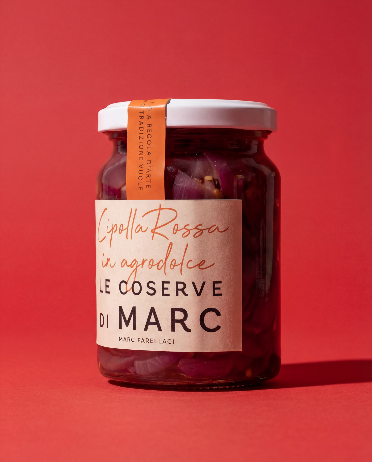
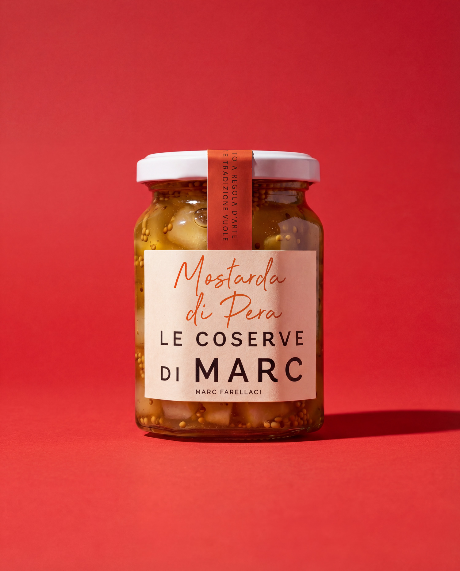
Client and context

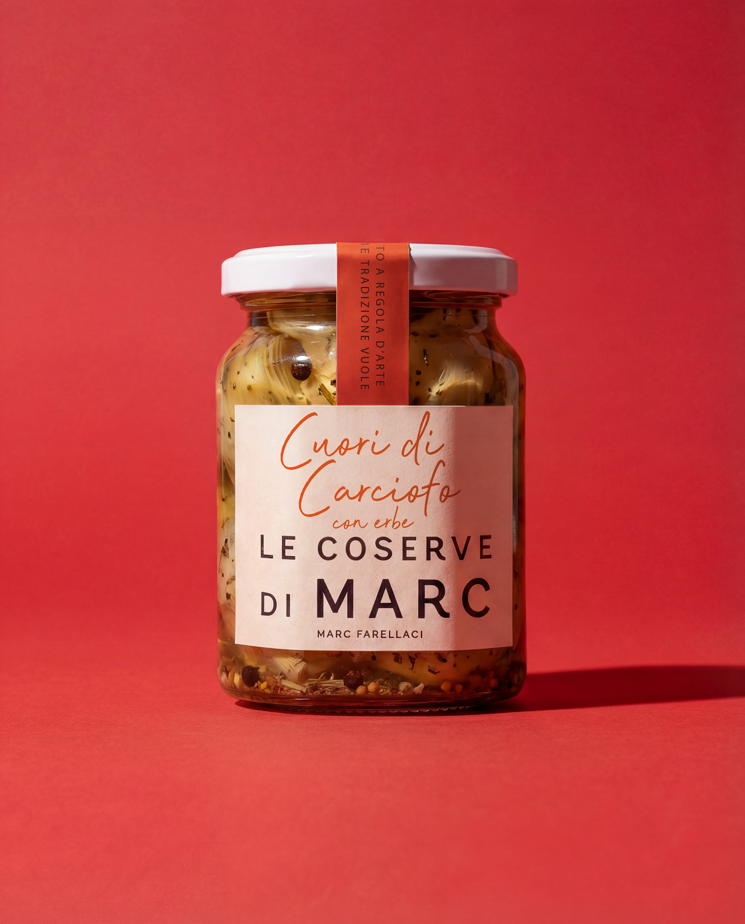
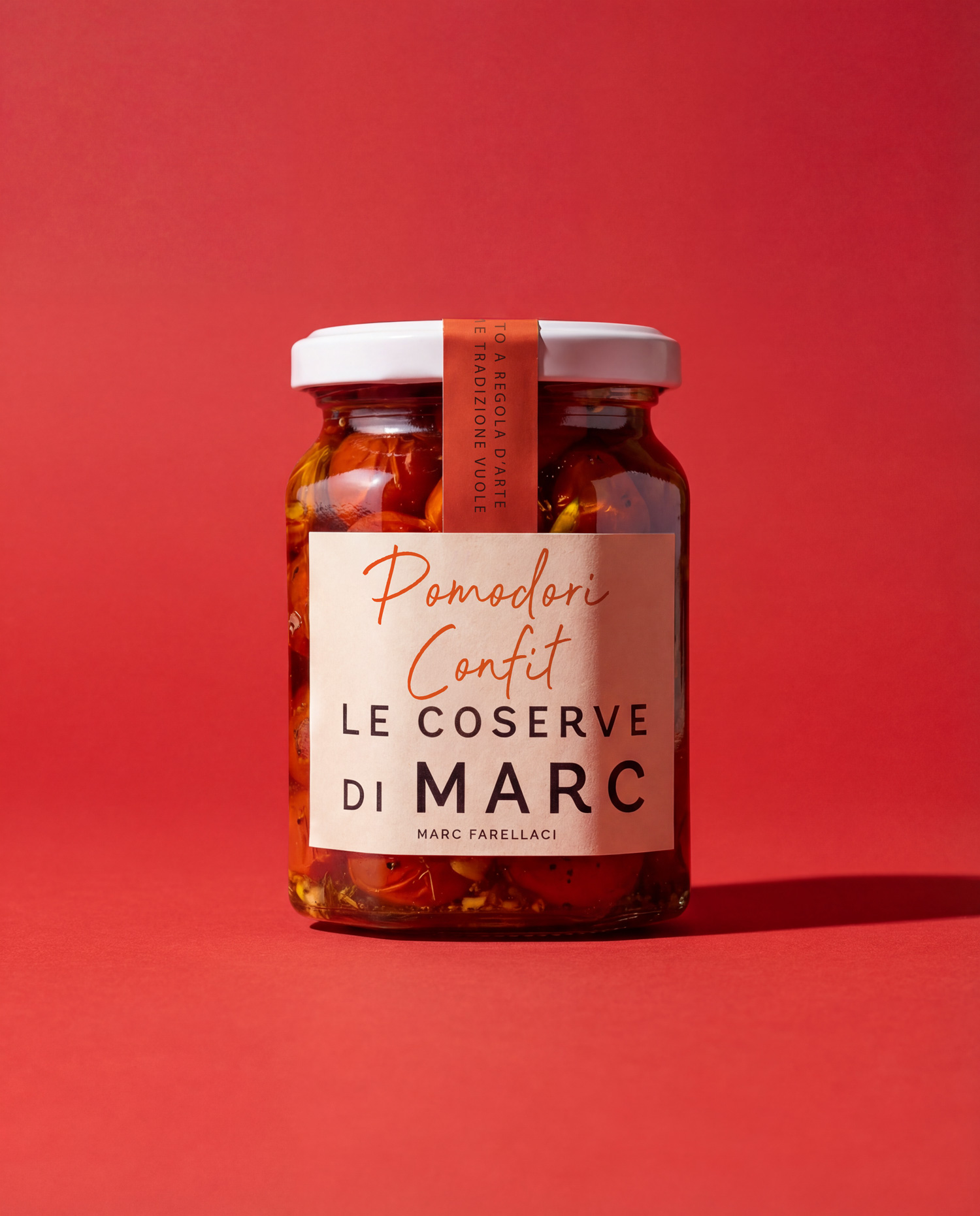
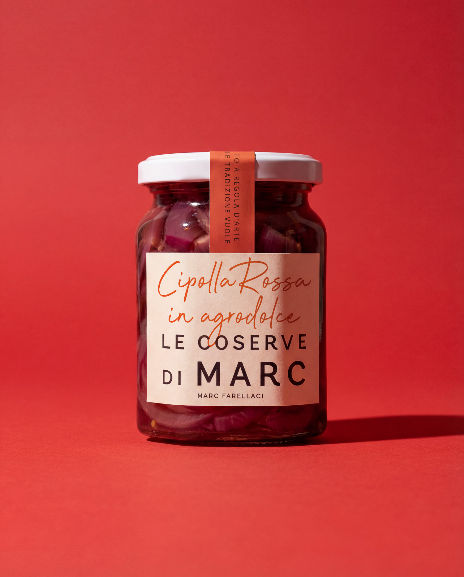
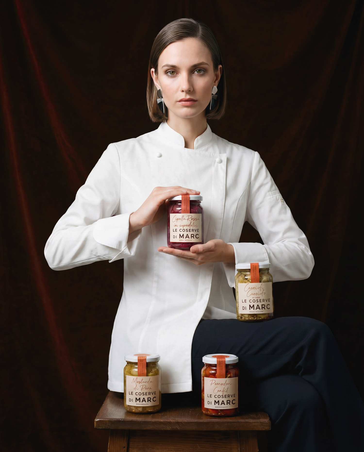
Chef Marc Farellacci ask us to help him with the launch of “Le Conserve di Marc”, a line of gourmet preserves aimed at high-end delicatessens and specialty food shops, with 100% Italian products made following traditional recipes. The project required a visual identity able to position the brand in the premium segment, while maintaining a warm, artisanal language consistent with the chef’s personality.

Project goals

Create a recognizable brand that could scale across multiple product SKUs. Clearly communicate Italian origin, craftsmanship, and “made to perfection” quality at first glance. Ensure strong readability and shelf impact in highly curated gourmet retail environments.

Branding strategy

The identity is built around the name “Le Conserve di Marc”, with the chef’s full name acting as an endorsement to position him as a guarantee of quality. The claim “100% Italian product – made to perfection, as tradition dictates” summarizes the brand positioning and makes the link to origin and craftsmanship explicit.

Label design

The labels are designed as a modular family: each product (Sweet-and-sour red onion, Artichoke hearts with herbs, Pear mustard, Confit tomatoes) follows a consistent typographic structure that reinforces the range identity. The visual hierarchy prioritizes the brand block and the product name, ensuring immediate recognition and easy navigation on the shelf. The repetition of the brand name and the signature “Marc Farellacci” works on memorability and emphasizes the authorial nature of the line.

Outcome

The result is a branding system that combines the solidity of a structured brand with the sincerity of an artisanal product, ready to be distributed in high-end gastronomic contexts. The labels give the preserves a coherent and recognizable visual presence, enhancing the chef’s story and supporting a premium positioning in retail.